EPA: Climate change explained in graphics

How has the climate changed? These graphics from the EPA's archived website tell the story.

    Note: See more about what causes climate change here.

Earth's changing atmosphere
carbon history.jpg
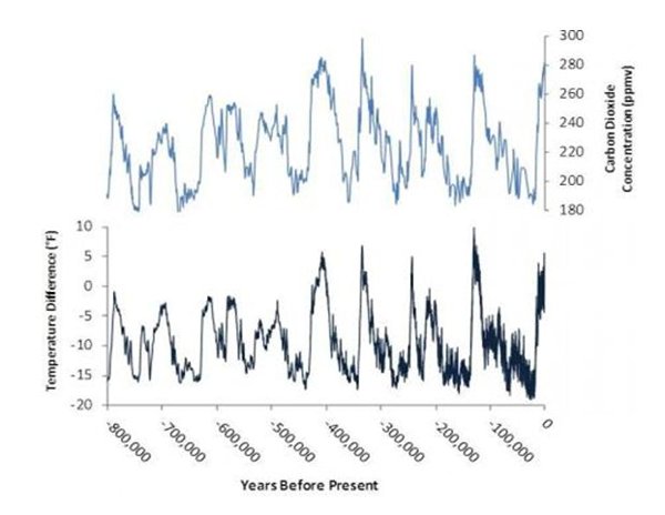
Estimates of the Earth’s changing CO2 concentration (top) and Antarctic temperature (bottom), based on an analysis of ice core data extending back 800,000 years. Until the past century, natural factors caused atmospheric CO2 concentrations to vary within a range of about 180 to 300 parts per million by volume (ppmv). Warmer periods coincide with periods of relatively high CO2 concentrations. Note: The past century’s temperature changes and rapid CO2 rise are not shown here. --Graphic: EPA, based on a National Academies of Science report.

Greenhouse gas spike:

gas graph.jpg
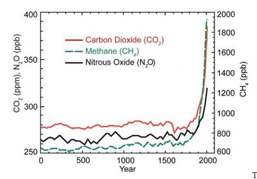
This graph shows the increase in greenhouse gas concentrations in the atmosphere during the last 2,000 years. Increases in concentrations of these gases since 1750 are due to human activities in the industrial era. Concentration units are parts per million (ppm) or parts per billion (ppb), indicating the number of molecules of the greenhouse gas per million or billion molecules of air. Source: U.S. National Climate Assessment, 2014.

Atmospheric Carbon Dioxide

graphic co2.jpg

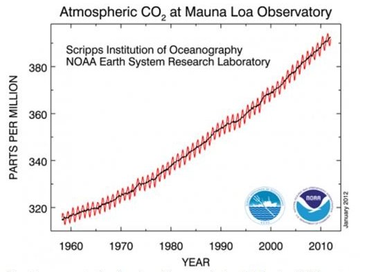
Atmospheric carbon dioxide concentration has risen from pre-industrial levels of 280 parts per million by volume (ppmv) to over 401 ppmv in 2016. Since 1959 alone (shown here), concentrations have risen by more than 85 ppmv. The yearly rise and fall in the chart reflects the growth and decay or northern hemisphere vegetation. Source: NOAA.